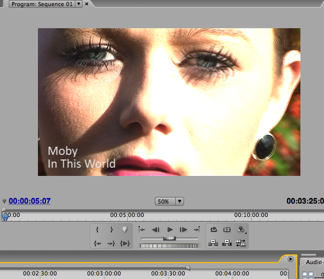
Here is my final film, enjoy!
Monday 4 April 2011
Digipack and Magazine advert
 Digipack 1
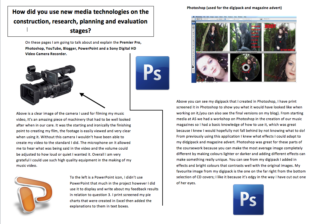
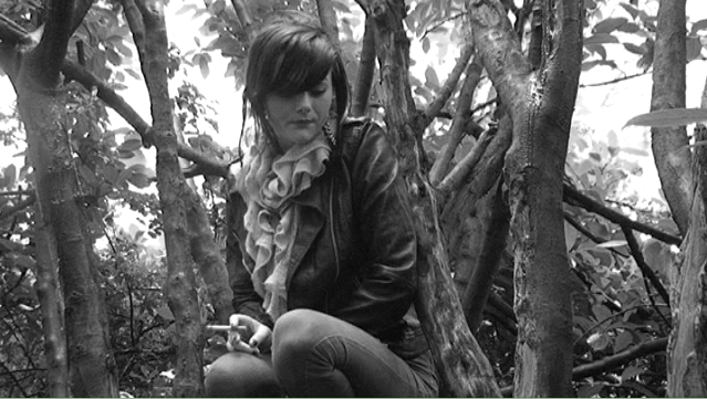
Above are my first three images to my digipack. To the far right you can see the image that would be used as the CD front cover, I think its quite a statement piece and the image is a nice natural picture of Taylor in a setting of green trees that relate well to the actual muic video, the red writing contrasts well with her red accessories which makes it stand out that little bit more. I have also placed an effect on this image called 'grain' which gives it an edgy unique feel.
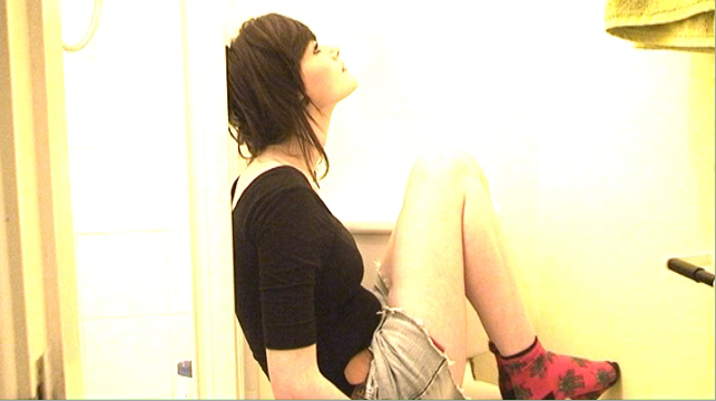
The middle image which would be the back cover of the CD is in fact a screen shot of Taylor from my edited film, I think the fact its a natural pose with no adjustments made makes it seem raw and in theme with the video itself and the song. The red writing again contrasts well with the green background.
The final image is to the far left and would be used for an inside sleeve of the CD, the image is quite a striking pose with the same 'grain' effect I added onto the front cover. Again Taylor has red accessories that go really well with the other two images and they all contrast well with eachother.
 Digipack 2
Above is the set of my second digi pack being the other three images for the CD. Starting with the far right image you will see half of Taylors face, reason being is beacuse all along Ive tried my best and worked hard to create a unique edgy raw film and I wanted these supporting products to be the same and do it justice. This image would also be an inside sleeve for the CD and the effect used is again 'grain' to match with the previous images. There is a red signature from Taylor on this image to give it a personal touch, which I think it does.
The middle image is what the actual CD would be and as you can see I have placed the image I would use for the front cover onto the CD with the words 'Moby' and the song title swirled around the hole in the middle. I really like this idea and thought it looked good again keeping in with the unique feel I was going for.
The last image to the far right would be another inside sleeve picture, its another picture of Taylor tilted to the side to give a quirky feel! The big earrings to me, make it seem like a statement piece and the effect on the pose keeps it real.

Magazine advert
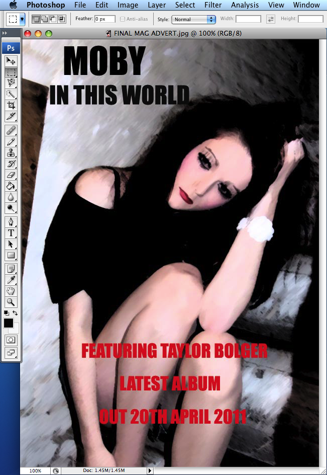
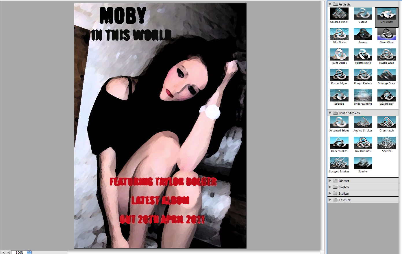
Above is the magazine poster I created in Photoshop to promote the artist and the single/album. As you can see Its an image of Taylor posing on a set of stairs, I think its a really raw, funky image which goes well with the other supporting products. Again I have the red writing which contrasts to the digipack, the writing is bold and in capital letters to create a great impact.
The effect I put onto the image has made it seem like shes been painted and gave it quite a cartoon feel to it. Her makeup is bold and creates such a dramatic look I think it gells brilliantly with my digipack and the music video.
The title of the poster is quite plain however still bold in jet black colour and font. What I also like about it is the shadow you can see to the right of her, this again just adds to the drama and rawness of the image and makes the overall poster that bit more interesting.
EVALUATION - Question 1
In what ways does your media product use, develop or challenge forms and conventions of real media products?
Above are the 9 explanations to my nine screen shots and below are the print screens to my 9 screen shots.
1.My first image is the opening shot to my film, which shows Taylor staring directly into the camera, I feel this shot is important to my film because it symbolizes how she feels and the way that she looks tells the audience she’s obviously not happy and quite moody which incidentally is the theme I was partly going for.
2.My second shot that I captured, I feel shows an important part of Taylors life and the different stages that she’s going through during the whole break up torment, it shows her and Ryan together really happy and it just goes to show how different their lives have been and how opposite their feelings have been.
3. My third shot again shows Taylor and Ryan lying in bed with Taylor looking at Ryan in a daze almost with a dreamlike feel to it. This shot in particular symbolises what they have been through especially Taylor because throughout the music video shows how up and down her emotions are and because this specific shot was shown towards the end of the film could mean they got back together, however you would never be able to tell if this is the actual case.
4. My fourth image captured is of Taylor and Ryan having one of the many arguments in the film, the shot is in black and white symbolising that everything is clearly not ok. You can see Taylor blowing smoke into Ryan’s face obviously to annoy him, the shot itself is a medium close - up and the effect used shows them in four separate squares the name of this is replicate. To me this image mainly symbolises the hate that the two of them have for each other at this particular stage in their relationship, so that’s why its one of my nine screen shots.
5. I really like this shot of Taylor, it not only shows her and her emotions but also the mise en scene in the background, the use of lighting is great too you can see it shining through the trees to give again a dream like feel to it.
6. My sixth shot shows a black and white image of Taylor running, this immediately asks a question to the audience what and why is she running from? I feel it shows her vulnerable side and makes her seem lost in herself. The visual effects of the image show a long distance shot used also black and white, I chose black and white for this particular shot because its not a happy part of her life and throughout the film I used black and white on and off so it wasn’t one colour throughout, I felt this gave it a more unique edge.
7. This particular image shows a close up shot of Taylor staring directly into the camera, the effect used shows her face looking illuminated I chose this effect in particular to make her seem really emotional, not only does the effect show this but the look on her face is so personal and the way she is staring into the camera makes her seem she’s hurt and wants revenge in a way for the break up.
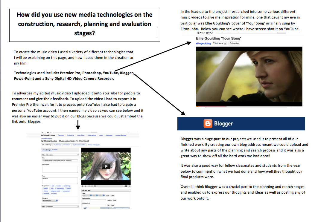
8. Throughout creating my film I got ideas from other music videos and one in particular ‘Ellie Goulding – Your Song’ really stuck out to me I really liked the ideas she had in it and I felt similar ideas would work well for my film, which coincidently refers back to my eighth image of Taylor you can see her smiling in between a set of trees again with the ‘echo’ effect which nicely shows through in the trees. This image symbolises her in a way that you can love AND hate someone at the same time as she’s obviously going through many different emotions but letting us the audience know clearly how she feels with the expressions on her face.
9. My ninth and final image shows a close up shot of Taylor, throughout my film I used quite a lot of close up shots so you can really see the expressions on her face and try and understand what she’s feeling. Again this idea came from watching Ellie Gouldings music video to ‘Your Song’ I noticed that there were many close up shots in that music video which led to me putting them in mine and image nine being a result of this.

Sunday 3 April 2011
EVALUATION - Question 2
For question 2 we had to write p a script for what we would say in our voiceover then edit this script we recorded into our music videos, we could also add specific pictures that we had in mind and various other things.
Below is my final edited voiceover and the script used for it
Hi I’m Georgina, and this is the music video I created for the artist Moby called ‘In this World’. The song is by an American electronic musician who released it as the second single off his 2002 album 18. The song features singer Jennifer Price on vocals. "In This World" reached number 35 on the UK Singles Chart.
In order for me to create the best possible image for my artist I wanted to combine influences from other music videos that I felt suited the ideas I had for mine, a particular one that caught my eye and that I continually used for influences was Ellie Goulding’s cover of ‘Your Song’ by Elton John. I liked how this video had a dreamy feel to it and how the songs emotional but the video consists of sad AND happy emotions. That’s exactly how I wanted my video to be.
In order for me to create a video that had the dreamy effect I wanted the main priority was to show the mise en scene of my video as early on as possible and to show it consistently throughout so I could add any affects needed to achieve this dreamy feel I had in mind. As said above the mise en scene was very important so parts of the video are just of the various settings I used so the audience at home would understand what Taylor (the main character in the video) is actually doing, maybe even relating to her.
The storyline of the video itself is a breakup between a girl and her boyfriend and I wanted to express this in a serious way not one that could be mislead as a joke, therefore I didn’t want any cartoon effects or comical things in the video. I didn’t feel the need to add subtitles or even have lip-syncing in the video because I wanted the audience to understand how the characters are feeling through their emotions and facial expressions which I think were quite clear.
Due to wanting such raw emotions shown in my video I used a range of close up shots planted in different places throughout the video so hopefully the emotion of Taylor is shown without having to be too literal. And also by doing this I experimented and played around with different effects, a favorite of mine was an effect called ‘echo’ as this enhanced the dreamy feel I was after, it basically made the shot of where I wanted the effect to be really bright and light and by also slowing down various different shots, again enhanced the specific dreamy feel. The use of different effects hopefully made the audience aware of the storyline and what it meant.
As said in my original plan for the video I wanted the style of the characters and the clothes that they would be wearing to be quite indie and funky and when thinking of this my first thought was the popular TV show ‘Skins’, and a main character of this program from a previous series is ‘Effy’ someone that I definitely tried to base Taylors appearance on. The image I tried to portray was quite a messy although yet funky and quite ‘out there’ image. I think many of the younger generation of the audience watching the video, would recognize ‘Effy’s’ style and the whole ‘Skins’ theme.
For my digipack I wanted to keep in with the theme of the video as a whole and not forgetting to relate to my target audience. The pictures taken for the CD covers were done outdoors to get the mise en scene in shot; I felt this would merge well with the idea of the video. I don’t think I based the images for the digipack on any particular CD covers I have seen in the past I kind of went with what I felt looked good and how well it suited the video. Most of the pictures for the CD covers were however quite moody, stern images.
For my magazine poster, that would be advertising the single, I wanted to keep it quite plain but still in theme with the video. Its an image of Taylor who by now the audience should know is the main character in the music video, posing on a set of stairs, I added an effect to make the image appear quite blurry and perhaps even like she’s been painted. I felt it looked really unique and because the way she is posing is again moody and serious it keeps in with the theme of the CD covers for the digipack. The bold writing on the poster keeps it modern and realistic and also grabs the audience’s attention; I feel overall it’s quite a statement piece.
To conclude I felt that I have successfully accomplished a professional looking music video and displayed the editing techniques within my video made on Premier Pro. The feedback I received from fellow piers and others, was really good and I am really pleased with the outcome however constructive criticism is also a good thing and finding out what people didn’t like was quite interesting.
Overall I felt my digipack and magazine advert promoted my artist well and that my music video created the image I wanted my artist to have, I also feel the two products merged well together to create a great final finish.
Saturday 2 April 2011


EVALUATION - Question 3 - Feedback from fellow peers for supporting products (Digipack and magazine advert)
As part of the evaluation I gathered as much feedback as possible from my fellow peers, below is the video for my supporting products feedback.
Friday 1 April 2011
EVALUATION - Question 3 - Feedback results for my Music Video
Again part of the feedback process was to have my fellow peers view my music video then discuss what they think. Below is the feedback.
EVALUATION - Question 4
How did you use new media technologies on the construction, research, planning and evaluation stages?


Friday 18 March 2011
Annual A2 Music Video Screening
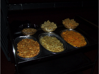
Every year once all of the music videos have been created, edited and finalised, there is an annual screening for friends and family to come and watch our music videos. Food and drink is put on display and this year was no different, it was a great way to show off our films and to let friends and family know the hard work and effort we all put in to creating them. It was also a way to receive feedback in relation to question 3 of our evaluation. The audience members had a small pack that they would fill out and rate all of our music videos.
Below are some pictures taken from the event

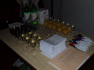

Below are some pictures taken from the event

Friday 11 March 2011
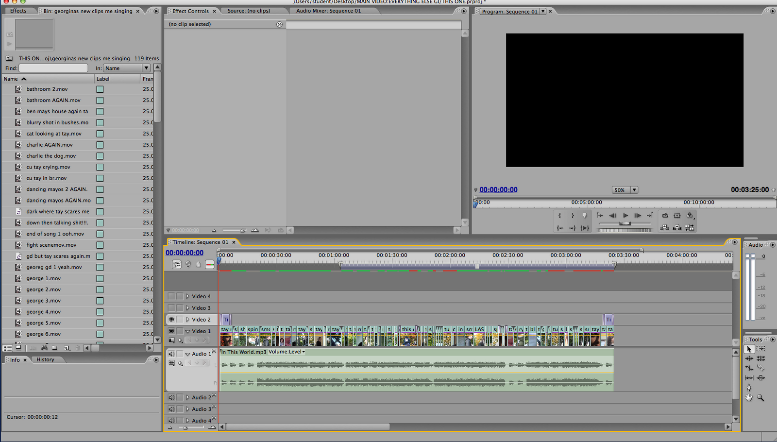
Development of Digipack
With the digipack I only used the same steps once for both sets of CD covers even though there are two sets of CD covers. However I did apply different effects for each CD cover.
Digipack 1
Digipack 1
Below are my first three images to my digipack. To the far right you can see the image that would be used as the CD front cover, I think its quite a statement piece and the image is a nice natural picture of Taylor in a setting of green trees that relate well to the actual muic video, the red writing contrasts well with her red accessories which makes it stand out that little bit more. I have also placed an effect on this image called 'grain' which gives it an edgy unique feel.
The middle image which would be the back cover of the CD is in fact a screen shot of Taylor from my edited film, I think the fact its a natural pose with no adjustments made makes it seem raw and in theme with the video itself and the song. The red writing again contrasts well with the green background.
The final image is to the far left and would be used for an inside sleeve of the CD, the image is quite a striking pose with the same 'grain' effect I added onto the front cover. Again Taylor has red accessories that go really well with the other two images and they all contrast well with eachother.

The stages were pretty much the same to creating my magazine advert however I had three small squares (just like the ones above) instead of one large rectangle or square

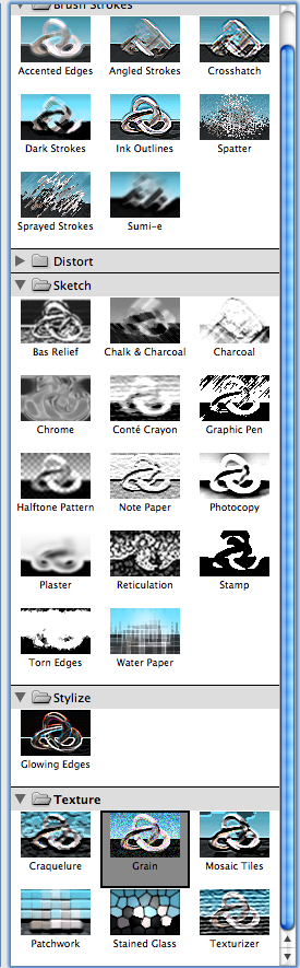
Again as you can see above I played around with different effects before I finally settled for the ones I have. All six of my CD covers have different effects, maybe a couple of them have the same effect
Above is an image of the toolbars situated to the left of Photoshop
Digipack 2
Below are the set of my second digi pack being the other three images for the CD. Starting with the far right image you will see half of Taylors face, reason being is beacuse all along Ive tried my best and worked hard to create a unique edgy raw film and I wanted these supporting products to be the same and do it justice. This image would also be an inside sleeve for the CD and the effect used is again 'grain' to match with the previous images. There is a red signature from Taylor on this image to give it a personal touch, which I think it does.
The middle image is what the actual CD would be and as you can see I have placed the image I would use for the front cover onto the CD with the words 'Moby' and the song title swirled around the hole in the middle. I really like this idea and thought it looked good again keeping in with the unique feel I was going for.
The last image to the far right would be another inside sleeve picture, its another picture of Taylor tilted to the side to give a quirky feel! The big earrings to me, make it seem like a statement piece and the effect on the pose keeps it real.

Below are again the different effects that I could have used for these CD covers

Below are a close up of the different effects that could/can be used for creating something in Photoshop
Overall I am really happy with the effects and colours I added into my images and I think the final outcome was really professional and merged well with my magazine advert and final film
Development of Magazine Advert
Below is the magazine poster I created in Photoshop to promote the artist and the single/album. As you can see Its an image of Taylor posing on a set of stairs, I think its a really raw, funky image which goes well with the other supporting products. Again I have the red writing which contrasts to the digipack, the writing is bold and in capital letters to create a great impact.
The effect I put onto the image has made it seem like shes been painted and gave it quite a cartoon feel to it. Her makeup is bold and creates such a dramatic look I think it gells brilliantly with my digipack and the music video.
The title of the poster is quite plain however still bold in jet black colour and font. What I also like about it is the shadow you can see to the right of her, this again just adds to the drama and rawness of the image and makes the overall poster that bit more interesting.
When starting this task I had to firstly create a blank document in photoshop as you can see from the screen shot below. This image is however not fit to scale

Then I would have placed in the particular image i wanted e.g. the one seen in my final magazine advert
When everything was in place I would have then started to play around with effects and different colour's

The effect I went for in the end was a blurry painted effect that I thought made my image stand out really well and made it seem quite unique. However before applying the effect I wanted, I messed around with some others first
Overall I am definitely happy with my final image and the effects I chose for it
Thursday 10 March 2011
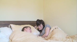
Location shots of where the filming took place
When filming my music video I used a variety of different locations. Below I have print screened images of the various locations I used.


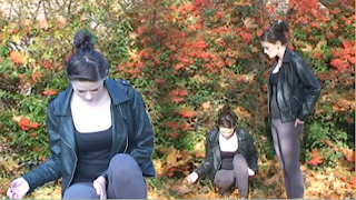


Woods
Living room in a house

Trees
Garden

Bedroom

Living room in another house

Different garden

Leaves, trees, grass etc

Toilet in a house
Bathroom in a house

Bed in a bedroom

Tuesday 1 March 2011
Risk Assessment for A2 Music Video
This is a print screen of my risk assessment as you can see I have hopefully covered every detail that will need to be considered when filming.

Wednesday 23 February 2011
Shot list
Below is a detailed list of all the shots in my music video
Shot 1 - Close up of the girls face, cmara moving towards her
Shot 2 - Medium close up of the girl in a woods setting in black and white
Shot 3 - Medium close up again of the girl getting up and looking around. In black and white
Shot 4 - Medium close up of the girl walking, in colour. Cameral follows her moving
Shot 5 - Close up shot of the girl and the boy fighting in black and white
Shot 6 - Medium close up of the girl and boy fighing again in black and white. Replicate effect added
Shot 7 - Extreme close up shot of the girls eye in colour
Shot 8 - Medium close up of the girl and boy being happy together in colour, in a house setting
Shot 9 - Medium close up of the girl and boy being happy together in colour, in a house setting
Shot 10 - Close up shot of Just the girl in black and white
Shot 11 - Medium close up of the girl in black and white surrounded by trees
Shot 12 - Medium close up colour shot of the girl spinning around towards the camera
Shot 13 - Medium close up shot of the girl and boy in a house setting, laughing and smiling together
Shot 14 - Extreme close up of the girls lips in colour
Shot 15 - Two shot of the girl and boy figghting again, in black and white to represent the negative times
Shot 16 - Whip pan of the girl in colour in a woods setting. The camera follows her as she walks
Shot 17 - Close up of the girls legs walking in colour. The camera follows her along as she walks
Shot 18 - Long shot of the girl running away from the camera into the distance in black and white
Shot 19 - Close up of the girls legs walking in colour. The camera follows her along as she walks
Shot 20 - Close up of the girls face in the woods, the camera zooms out on her. In colour
Shot 21 - Close up of the girl in colour throwing her makeup onto the bed in anger
Shot 22 - Moving shot in slow motion of the girls head in colour
Shot 23 - Medium close up two shot of the girl and boy arguing again, in black and white
Shot 24 - Extremley fast moving shot of trees in colour
Shot 25 - Extreme close up of the girls head walking not facing the camera, in colour
Shot 26 - Extreme close up of the girl looking into the camera in black and white
Shot 27 - Medium close up of the girl and boy dancing together (their happy memories)
Shot 28 - Medium close up of the girl standing next to a tree in colour
Shot 29 - Long shot of the girl laughing in clour surrounded by trees. Handheld camera
Shot 30 - Medium close up of a shadow on the grass, in colour
Shot 31 - Two shot of the girl and her friend laughing together in a woods setting
Shot 32 - Close up of the girls face in colour staring directly into the camera. This shot fades out into shot number 33
Shot 33 - Medium close up cloning shot. There are three of the same girl that fade out one by one, in a woods setting. This shot also fades out, into shot number 34
Shot 34 - Medium close up of the girl sitting on a toilet
Shot 35 - Close up of the girl looking into a mirror
Shot 36 - Medium close up of the girl walking, in colour. Cameral follows her moving
Shot 37 - Close up of a shadow on the grass
Shot 38 - Close up of grass, the grass then flashes from light to dark for effect
Shot 39 - Extreme close up of the girls head moving up, this head movement is then repeated three times in the same shot
Shot 40 - Slow motion pan of the trees, in colour however no effect added to it
Shot 41 - Extreme close up of the girl looking away then directly towards the camera. An 'echo' effect is added
Shot 42 - Medium close up of the girl in a bathroom setting walking slowly towards the camera, in black and white
Shot 43 - Close up two shot of the girl blowing smoke into the boys face. Extra slow motion in black and white
Shot 44 - Shot of the girl smiling, turning around then running away from the camera, in a woods setting
Shot 45 - Long shot of the girl standing by a tree in black and white
Shot 46 - Medium close up of the girl again leaning on a atree, however in colour and smiling
Shot 47 - Long shot of the girl standing by a tree in black and white
Shot 48 - Slow motion close up pan of the girl smiling whilst spinning. The shot fades out into shot 49
Shot 49 - Extreme close up of the girls eye in colour
Shot 50 - Extreme close up of the girls lips in colour
Shot 51 - Extreme close up of the girls eye in colour. This shot fades out into shot number 52
Shot 52 - Medium close up two shot of the girl and boy having happy times in a house setting
Shot 53 - Medium close up two shot of the girl and boy arguing in a black and white effect
Shot 54 - Colour shot of the girl running away from the camera towards a house
Shot 55 - Slow motion shot of the girl lifting her head up in colour
Shot 56 - Blurry shot which results in seeing the back of the girls coat. In a woods setting.
Shot 57 - Medium close up of the girl by a tree looking down at the ground
Shot 58 - Colour shot of the girl getting up and looking around. In a woods setting
Shot 59 - Long shot of still trees in colour
Shot 60 - Medium close up shot of the girl in the middle of a trees setting
Shot 61 - Slow motion pan of the trees, in colour with an 'echo' effect added
Shot 62 - Medium close up of the girl smiling. She tilts her head towards the camera, in a woods setting
Shot 63 - Extreme close up of the girl smiling
Shot 64 - Medium close up of the girl in a woods setting, staring at the floor
Shot 65 - Close up of the girls legs walking in colour. The camera follows her along as she walks. With a black and white effect added
Shot 66 - Medium close up of the girl taking in cigarette smoke, in colour
Shot 67 - Black and white shot of the girl blowing out the smoke from shot 66
Shot 68 - Extreme close up of the girls eyes in colour. She does a blink in slow motion, then looks up
Shot 69 - Medium close up two shot of the girl and boy in bed. The girl is staring at the boy, to represent her and her boyfriend getting back together
Shot 70 - Slow motion close up shot of the girls head and shoulders spinning whilst smiling and laughing, also to represent her and her boyfriend getting back together
Email request to chosen artist: 'Moby'
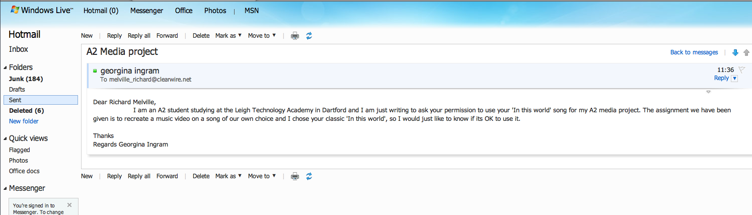
As part of the music video project we had to email our individual chosen artists to ask permission if we could use their song for copyright reasons. Because the song was used for educational purposes there was hopefully going to be no problems and fortunately I didn't hear anything back from Moby or his management so i went ahead with using his song.
Target audience for the music video
The target audience that my music video is aimed at are young adults, this meaning anyone from the age of 15 - early 20's. I think that this is the age range most suited to what my video is all about. Considering that the video is about two love struck teenagers thats the theme Im going for in terms of who its targeted at.
Having said this I still think the more mature person could watch it and enjoy it too because the song is one that could and is still remembered.

Having said this I still think the more mature person could watch it and enjoy it too because the song is one that could and is still remembered.

Friday 11 February 2011


Subscribe to:
Posts (Atom)